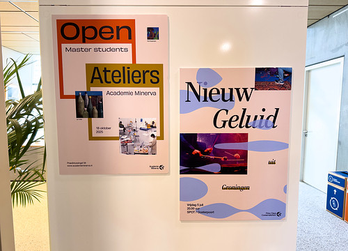
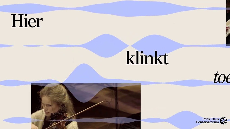
Starting today, October 15, we are proud to present the new website and visual identity of the Prince Claus Conservatoire and Minerva Art Academy! Both institutions have a long history in Groningen and are linked to the city. We are at the heart of the world and strive to make an impact. It’s time for our own identity.
New branding and website for the Prince Claus Conservatoire and Minerva Art Academy
- News

The art institutes Minerva Art Academy and the Prince Claus Conservatoire are strong learning communities, where we create through research, research through creation, experiment, and collaborate. We embrace mistakes and challenges. With imagination, we question boundaries and engage in dialogue with our surroundings and time. Both of our communities are places where diversity is valued and where openness and inclusion are core principles. This is what we stand for, and it is something we are proud of.
Branding and Websites
The development of the Hanze brand, with a renewed visual identity and logo, has prompted us to reflect on the desired look of the art institutes. This allows us to differentiate and position ourselves as art institutes. The result is a unique visual identity and website for both Minerva Art Academy and the Prince Claus Conservatoire, aligned with Hanze but with their own identity that reflects who we are and what we stand for.
We now have our own logo, typography, colors, and design language, making us recognisable and consistent as a brand.
We worked together with the creative design company Thansk for creating our visual identity and with The Factor.e for building the websites.
The New Logos
The typeface used in the logos was designed by an alumnus of Academie Minerva: typographer Jelmar Geertsma. Geertsma, born and raised in Groningen, graduated from Academie Minerva in 2009. Among other projects, Jelmar designed the typeface Gronika, which embodies the DNA of Groningen. He drew inspiration from the architecture and signage of the city. The work of graphic designer Wim Crouwel also played a role in this process. Additionally, he created the reading font for the Dagblad van het Noorden newspaper, called Chaton. The typeface in the logo is a new typeface, De Azimut Grotesk. The foundation of this typeface is the Mercator, also known as the "Dutch Helvetica." Jelmar based his version on a type sample made by Wim Crouwel (a Minerva alumnus) in 1964. This makes the choice of this typeface a tribute to the past, present, and future of Academie Minerva.

Feedback component
How satisfied are you with the information on this page?